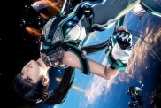
If the outlandish title didn’t already give it away, Square Enix wants to make it perfectly clear that Lightning Returns: Final Fantasy XIII will be a drastic departure from the prior two installments.
The game is said to be a bit darker this time around, as is evidenced by the edgy new title font. In an interview with Kotaku, art director Isamu Kamikokuryo discussed the game’s serious new setting, saying:
When I first looked over the proposal documents given to me by the director, I thought it would be a great fit to have the following three elements as the main pillars: the elements of a mechanical design, which is consistently used throughout the FFXIII series, elements of fantasy, which is characteristic of the whole Final Fantasy series, and an element of gothic design, in a very broad kind of way.
We are picturing the streets and alleys of London around the time of the Industrial Revolution, near the end of the century.
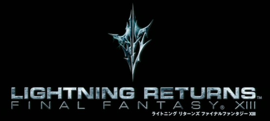
Kotaku also questioned the studio on whether or not the new logo was inspired by that of Skyrim‘s iconic emblem, to which producer Yoshinori Kitase replied that no, that decision was not made intentionally. “We revamped the title logo because we wanted to convey the ‘newness’ of this installment,” he said, adding that “our intention was to present a newness using an emblem with sharp edges and a symmetrical design. And so there is no relation to Skyrim whatsoever. Of course, there are many members of the dev team that enjoy playing Skyrim.”