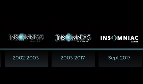
Closing in on the 25th anniversary of the company, and the 15th anniversary of Ratchet & Clank, Insomniac Games revealed a new logo that embodies the evolution of their brand since their last logo change just before the launch of the first Ratchet & Clank. In a blog post about the re-branding, Insomniac talked about the decision to create a new look for the developer.
We’ve always tried to evolve with the constantly changing industry we adore. That’s one of the challenges and blessings of remaining completely independent as a studio. But our logo has largely remained the same while we continue to grow. Considering our 25th anniversary in a couple years, and the 15th anniversary of Ratchet & Clank this year, it has become even clearer to us that it’s time to more closely match our visual identity with our studio vision.
As we contemplated a re-brand of our visual identity, we challenged ourselves to “think beyond the moon.” That meant eschewing a simple logo refresh. Instead, we wanted a redesign that reflected our evolution as a studio and as people while retaining some familiarity to our past logo treatments.
If there are any design geeks out there (I know my wife will appreciate this), the blog post dives into some of the details that make up Insomniac Games’ new logo.
We reviewed this design very early in the exploration process. It caught our attention immediately, and wouldn’t let go even after we explored other directions. It works on multiple levels for us. It’s got a lunar theme, with what appear to be two crescent moons facing each other as the “O” – reminiscent of our past and future. Many folks here also see a portal or lens for the “O”, which we like because it symbolizes exploration as well as how many of our fans see us differently. Some follow us simply because we created their beloved Spyro the Dragon. For others, it’s all about Ratchet & Clank, or Resistance, Sunset Overdrive, our virtual reality games or Song of the Deep. And now we have entirely new fans swinging into our neighborhood to check out the latest on Marvel’s Spider-Man.
Observant fans will see the subtle callbacks to our previous Insomniac Games logo, including the oversized “O,” serif lettering on the “N” and the positioning of “Games” as a core part of our identity.
Insomniac last changed their logo to the iconic moon in 2002 when Ratchet & Clank launched. They highlighted a few of the big things that have happened since then.
- Released 25 games for PlayStation 2, PlayStation 3 and PlayStation 4, Xbox 360 and Xbox One, Oculus Rift virtual reality, mobile devices, PC and web browsers
- Launched 13 new game franchises across multiple genres and platforms
- Grown from approximately 50 employees to 275-plus spanning two studios on both coasts
- Seen more than 200 babies of employees enter the world
- Earned 18 workplace culture awards at the local, regional, state and national level
That’s quite the amazing history, and we wish Insomniac another great 15 years until their next logo change.
[Source: Insomniac]
