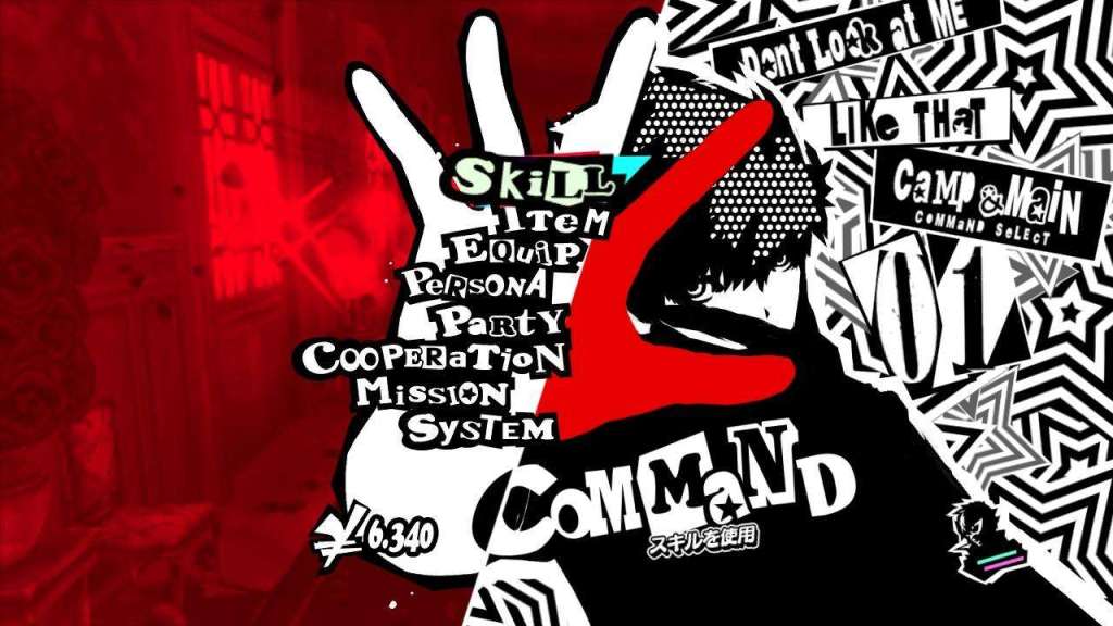
The Persona series is well-known for its striking art-style, but Persona 5 in particular took its UI up a notch. Atlus was at the recent CEDEC + KYUSHU 2017 developer conference in Japan, and during their presentation they went over the design process that goes into the style of the Persona titles. It’s a very interesting presentation for those that are interested in design philosophies and how these decisions are made.
The presentation was originally on Famitsu, but Siliconera was able to translate a lot of the presentation for English speakers. Here are some snippets from their article:
The turning point in UI design started from Persona 3, where they were faced with the problem of Atlus games being fun, but not selling well. The result of that reality was that Atlus decided to focus on the marketing of the games, and this included the UI design. It was the best way to attract a larger, casual audience, while changing the image brand of the series, at a low cost.
Persona 5’s menus also utilized a 3D model which would spin around and end with a pose. A special tool was made for this. The layout would be first created in Photoshop, then the motion designer would capture a pose and input it into the tool that would render the shot in 2D.
There were separate designers for the menu and battle scene UI, and the battle scene designer would pass along specifications to the programmer to be implemented, while checking every frame together to make sure it was correct.
There’s a lot more to read at the Siliconera article, including why the main colors of the Persona titles were chosen, how they got the UI to look similar on PS3 and PS4, and more.
What’s your favorite game UI or menu screen?
[Source: Famitsu, Siliconera]