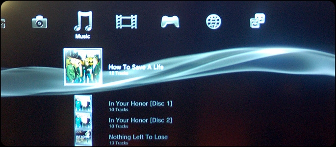
Ever since the PlayStation 3 launched back in 2006, the console has had the same user interface (UI) i.e. the XrossMediaBar, a very simple and easy to navigate system that isn’t cluttered with extraneous images, buttons, arrows and the like – something that was originally introduced by the PSP in 2004. The Xbox 360, 0n the other hand, overhauled its UI back in 2008, scrapping the confusing “blade” system for what they hoped would be a more intuitive, visual heavy system. In the end however, Microsoft’s NXE interface has essentially become a cluttered interpretation of the XrossMediaBar.
Now, in an effort to improve upon what has become a confusing and claustrophobic dashboard, Microsoft is innovating again, by streamlining their interface even further to mirror their Windows Phone 7 UI. Meanwhile, Sony has stuck with the Emmy Award winning XMB, finding much success with the interface mainly due to how beautifully simple it is. Unfortunately, it looks like Sony is taking a very different approach with the Vita, a decision I’m afraid will end up hurting the PlayStation brand and even bog down the PlayStation 3.
If you’ve seen any of the footage from Sony’s press conference at the Tokyo Game Show, then you’re likely aware of that fact that they’re pushing the Vita big time. During their briefing, they showed off the system’s new UI, which first made its appearance back at E3. I still remember cringing when I first saw that blue screen filled with circular icons – clearly meant to mimic the “app” style seen on iOS and Android devices. When they demoed the system at TGS, I was even more horrified as I saw a “peel” mechanic where you literally drag a corner of the screen down to unlock the next page. When Sony demoed it on stage, the mechanic appeared to more of a hassle than anything, leaving me with the sense that most of the touch based functionality on the device is quite gimmicky. Those who own an iOS or Android device will immediately find this touch-based method of unlocking similar, and is something that concerns me, because it reflects a sort of disjointed focus from within Sony. They’re positioning this to be a hardcore portable gaming device, but are borrowing way too much from smartphones. If Sony doesn’t work on unifying the UI, there’s no doubt in my mind that the Vita is going to suffer from an identity crisis.

Let’s also not forget the fact that the PS3 still has the XMB, a very different interface than its portable counterpart. Don’t you think it’s a bit counter productive of Sony to have their two gaming devices run on completely different UIs, especially when they’ve been touting the interactivity between the two? Unless of course Sony decides to bring this type of interface over to the PlayStation 3 as well. As I mentioned earlier, Microsoft is mirroring their new Xbox dashboard off of the portable interface they have for Windows Phone 7. If I was a betting man, I’d say that Sony may follow suit and we’ll have a new dashboard for the PS3 within a year that is very similar to what you see on the PSV. Let’s not forget that the Sony introduced gamers to the XrossMediaBar first on the PSP. And even if Sony doesn’t overhaul the UI for the PS3, there’s a chance that they’re testing this new UI on the Vita first with the intention of bringing it to the PlayStation 4, much like they did in the case of the PSP/PS3.
While I do think that Sony should have the same UI for both systems, I don’t think this “app-inspired” style is the direction they should go. With all of these icons floating around, there’s no coherent menu system to organize everything on the device, and, while we haven’t seen all of the features packed into the Vita’s interface, I doubt it will be any more user friendly than the XMB. The XrossMediaBar is clean, sleek and would work great on the Vita, not to mention the fact that it would be able to communicate perfectly with the current interface on the PS3. Some may argue that it looks and feels dated, but it’s a system that PlayStation owners have grown accustomed to over the past several years and one that isn’t crying out for an overhaul.
Sony needs to decide which direction they want to go. If they’re positioning the Vita and PS3 as gaming dedicated devices that are aimed at hardcore gamers, why are they going out of their way to make a goofy icon-based system that looks like it belongs on a smartphone. Maybe I’m mistaken, but from what I’ve gathered from the gaming community, there is still a lot of love for the XMB; so why does Sony feel as though they need to make these drastic changes? Deep down, I hope that Sony will realize the mistake that they’ve made with the Vita’s UI and offer a XMB option instead. With both Microsoft and Nintendo going after the casual audience, Sony should capitalize on their position as the company for the hardcore. Instead of focusing on UI changes, they should pour that time and money into developing more awesome exclusive titles. They created something special when they developed the XMB, and it’d be a shame to see them throw that away.


