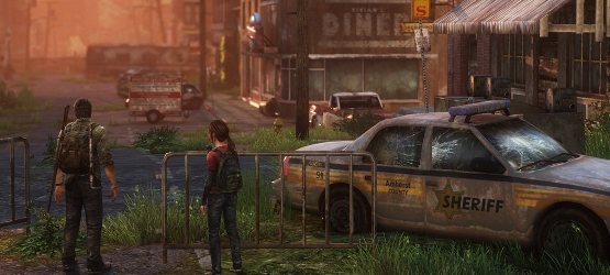
In a guest post on Kotaku, UI designer Alexandria Neonakis talks about how she joined Naughty Dog with eight months left to go in the development of The Last of Us and reworked the game’s UI. Starting out, the original HUD design had weapons, ammo, health and consumables in the top left corner of the screen. Players would use the D-pad to navigate with left and right shifting through weapons and up and down shifting through consumables.
“When this system was implemented,” writes Neonakis, ” it was assumed that when Joel picked up a new weapon, he would drop the one he was currently holding (just like in Uncharted). After testing out this system, the game design team decided that it would make more sense for Joel to keep all of the weapons he finds. This would allow the player to choose the weapon they felt was best for any given encounter, giving them more control over how they played the game. It also opened the door for a weapon upgrading system. We started to design alternatives to the implemented system based on these updated design requirements.”
Early designs also had a menu where you could swap and upgrade weapons all in one place. However, this proved to be cluttered and cumbersome, particularly in combat situation where players had to go to the menu to switch out weapons. Upgrades eventually worked through the benches located at various points which resolved the two problems they were having with the system: people forgetting about upgrades and people only going for the cheapest upgrades rather than saving up parts and looking at all of their options.
“When designing UI, if it feels cool the first few times, that’s not always a good indicator. The overall UI has to feel cool the next hundred times. In fact, it should actually start to feel better with time to the point where it becomes natural feeling and you start to lose awareness of the UI at all. If it ever feels clunky, annoying or frustrating, then it’s the wrong solution. When that happens, as a designer, you need to start all over again. In some cases, you have to throw out the ideas you feel pretty strongly about, too. I was adamant that upgrades and weapon slotting should be bound together, but testing and iterating proved me wrong.”
Neonakis closed the post by talking about the future of UI, especially with how it relates to the new generation of consoles. She says that “we’re still using the pipeline that we established during those final months of The Last of Us,” but will still be able to experiment as the development cycle goes on to further improve UI.
You can check out the full guest post here. What are your thoughts on the development of the UI of The Last of Us? Let us know in the comments below.