
When the PS4 was announced last week, what we all predicted would happen came true – the XMB was dropped. With close-up pics of the new UI released today, the Daily Reaction duo of Seb and Dan say farewell to the old interface, and hello to the revamp.
Seb: I’m a huge fan of the XMB, so I’ll be sad to see it go. It wasn’t perfectly implemented – there were odd setting choices and needless redundancies, but, as a whole, it did its job better than most systems. Let’s take a trip down memory lane and look at some of the interface’s milestones, as we bid goodbye to a decade of XMB:
Developed by SCE, the idea behind the XrossMediaBar is beautifully simple – you can go up and down, or you can go left or right, quickly getting to options and files. It’s fast to use and pretty intuitive, but critics point out that it is a little stark.
The first usage of the XMB dates way back to December 2003, when the PS2/DVR combo, the PSX, was released in Japan. This original XMB has barely changed since, keeping its simple look. It came to the PSP next, again allowing people to get to what they wanted quickly, and generally keeping out of people’s way. Then it spread across Sony – Sony TVs, Sony Cameras, Sony Ericsson mobiles and, most importantly, the PS3. As a result, it won a Technology & Engineering Emmy Award in 2006.
As its biggest single platform, the XMB will likely be most remembered as the PS3’s UI, and it served its purpose there, perhaps growing a bit too much as Sony added more and more options and features. The PS3 is the end of the XMB era, and Sony has now moved on.
First they brought out the Vita, with its controversial touch screen UI (which thankfully now supports button input). And now they’ve shown off the PS4’s new UI (currently unnamed), clearly a complete shift away from anything like the XMB.
After such a long time using one interface, it makes sense to move on, even if you thought that the XMB was perfect. When people boot up their PS4, they want something new, something next gen and that’s what they’ll get. Well… they’ll get something that looks a bit like the latest PS Store on the PS3, but let’s hope it isn’t as god-awfully slow and that the search function was designed better.
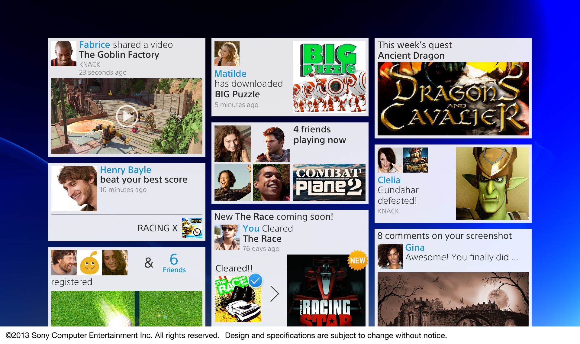
It also reminds me of tiles, Windows 8 and the ol’ New Xbox Experience. I get it, Sony, you liked what Microsoft did there, and I understand that you want this interface to work with touch screen devices as well, but I hope that doesn’t mean that normal users lose out, just like with the travesty that is Windows 8. Sometimes an interface has to be different for different users. This image, in particular, shows a lot going on, which could end up being annoying and cluttered.
I am, however, excited to get my hands on it, to try something fresh, and see how much has changed now that this console has been built with an entirely different approach than ever before. A lot still needs to be answered, like if the UI will look terrible when the console is not connected to the internet as all the social boxes will still be there but filled with identical “Connect” images like on the 360. That’s ugly, so I hope they realized that after playing some Halo.
With the touchpad built into the DualShock 4, we may also see some cool use of the touch interface, but just don’t make it mandatory like on the Vita. I want choice.
Dan: I agree, the XMB was an elegant way to have a user navigate between games, movies, images, friends and options, but, it ultimately fell apart under its own weight. Over time, the number of things that accumulated on certain sections of the menu started to become overbearing and cumbersome. This became apparent as users started to add multiple games, movies or images to the menu’s layout, and had very limited and almost cryptic methods to handle the bulk.
The main way that the PS3 had to organize files on its browser was to use the square button to choose between a few options of date, type or another user defined category (maybe more?). But, the explanation as to how these formatting system are handled is almost lost on anyone who is not a power user, as few know that you can generate your own folders by hitting the triangle button and labeling each file a category. Then, when under a certain organizational scheme, the browser would lump all the files of the same category together, generating a folder with the intended label. Explaining it here already seems confusing, as the number of steps to do something so simple is just confusing and clunky. Other operating systems have been managing to do this for some time, so it just makes me hope that Sony focuses on long-term usage with the PS4, instead of short term elegance.
Given that Sony does develop a number of devices, the ability to have an almost universal layout between products is a great idea, as it keeps you inside a comfortable ecosystem. As non-gamers get comfortable using the same interface on a phone or tablet, the ability for them to be able to move over to a console with a similar layouts also rises. So, if Sony can actually develop a much more user-friendly method to organize content, while removing clutter and potentially bringing in new users, I welcome the new UI. The images we see, do show it running on tablet and mobile, for example.
The one thing that I would be sad to see go is ability to use themes to personalize my interface. Now, Sony has not said that they are not bringing back themes, but given the new layout it seems that modding it will require a bit more than just swapping out images for new ones. This wouldn’t mean that they could not have ones generated themselves and sold on the store, it just means that the potential for users to generate their own could be a more complex proposition.
Looking at the new layout, I really do like it, but as Sebastian has said, some of the screenshots do show a bit of clutter. If Sony can find a way to manage content from multiple sources, while keeping it all very simple and not burying things under 20 menus, then they will have achieved something great.
Seb: At the end of the day, I need to be able to get to my game with the press of a button, and get to the store or Netflix within 2 button presses. That’s the most important thing.
Dan: Agreed, which is something that I wish they capitalized on more with the new buttons, as having a ‘share’ button just seems wasteful. Maybe if they changed that to simply start game or movie, it would be a nice way to get people moving to where they wanted to go in the first place.
Will you miss the XMB? Are you excited for something new? Will Sony make the interface PS Move-only? Share your stupid ideas below, or be even more pointless and email us at [email protected], or go to hell by following us at Satan and Devil.


