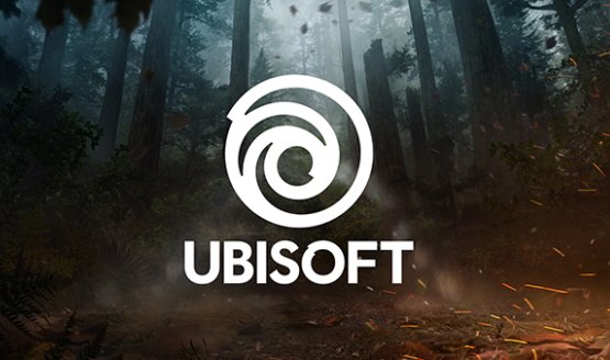
As Ubisoft starts a new era, “one with an increased focus on live and digital games as well as a player-centric approach to creating immersive worlds,” the company has debuted an updated look for their swirl logo.
“With this new look, we proudly embrace our role as a creator of worlds and invite you, the players, to continue playing, engaging, and growing with us,” Ubisoft said on their blog. “As we move towards our most exciting time of the year (E3!), you will see this new emblem take on the colors and textures of our worlds, and we can’t wait to hear what you all think.”
Here’s how their logo has evolved over the last 30 years:
The 1986 logo was inspired by the distinct visual style of the ’80s when Ubisoft was a local distributor of video games. The look changed changed in 1995 when Ubisoft moved from distributor to creator of mostly family-friendly games, then again in 2003 when they acquired Red Storm and began taking a more mature and diversified approach to games.
They added:
Today, we create worlds – worlds that live as video games, comics, movies, TV shows, books, and amusement park rides. Our new logo is minimalist, modern and monochromatic. It’s a window into our worlds, giving a preview of what’s to come by highlighting the artistry that goes into creating them. The swirl and the letter O are both deliberately created to be reminiscent of hand-drawn shapes and represent our human qualities of enthusiasm, curiosity and the grain de folie that Ubisoft is known for.
Ubisoft’s E3 2017 press conference takes place on Monday, June 12 and should feature Assassin’s Creed Origins, Far Cry 5, The Crew 2, South Park: The Fractured But Whole, and more.
[Source: Ubi Blog]
